
I’m always searching for new tools to explore the intersection between Social Media Analytics and Data Visualization. In last few years I have contributed to the development of Socioviz, a Social Network Analysis platform that allows you to analyze trends and conversations on Twitter, visualize the most relevant actors and themes.
Recently, I have started working on data extracted from Socioviz, specifically on the list of tweets, to make it compatible with RAWGraphs, an open source data visualization framework that aims to make the visual representation of complex data easy and accessible. In this post, I present some experiments of integration between the two tools, leveraging their strengths, with the aim of creating informative and original data visualizations.
One of core features of Socioviz is the ability to perform historical or real-time research (keywords, hashtags, etc.) on Twitter and visualize basic statistics as well as interactive graphs. To get more details on how the platform works, you can consult the online tutorials. The list of tweets can be exported in csv or xls format and offers, in addition to the tweet’s text, many other data that contribute to enriching each tweet with context information.
In the table below is a selection of the most important ones.
| Field Name | Contains | Example |
|---|---|---|
| User | socioviz | |
| Text | User that sent the tweet | 📌WEBINAR – Introduction to Social Network Analysis Understand methodology and applications of #socialnetworkanalysis with particular attention to the world of #socialmedia 🗓️ Mon Oct 17 2022, 12:00 PM CEST https://eventbrite.it |
| Language | Language (ISO Code) | en |
| Mentions | Users mentioned in tweet text | @user1 @user2 @user2 |
| Hashtags | Hashtags present in tweet text | #hashtag1 #hashtag2 |
| Words | Words excluding stopwords | Webinar introduction social network analysys understand methodology applications attention world |
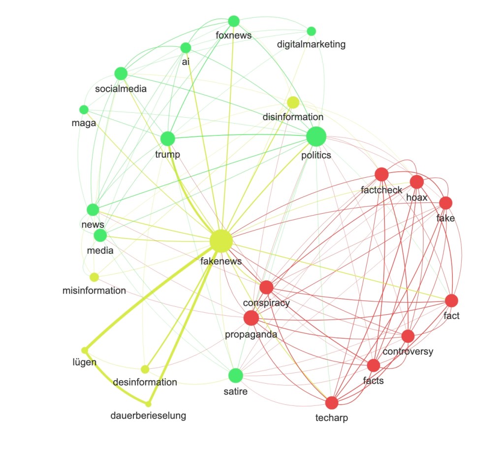
Example 1: Mapping the Twitter hashtags correlation (co-presence).
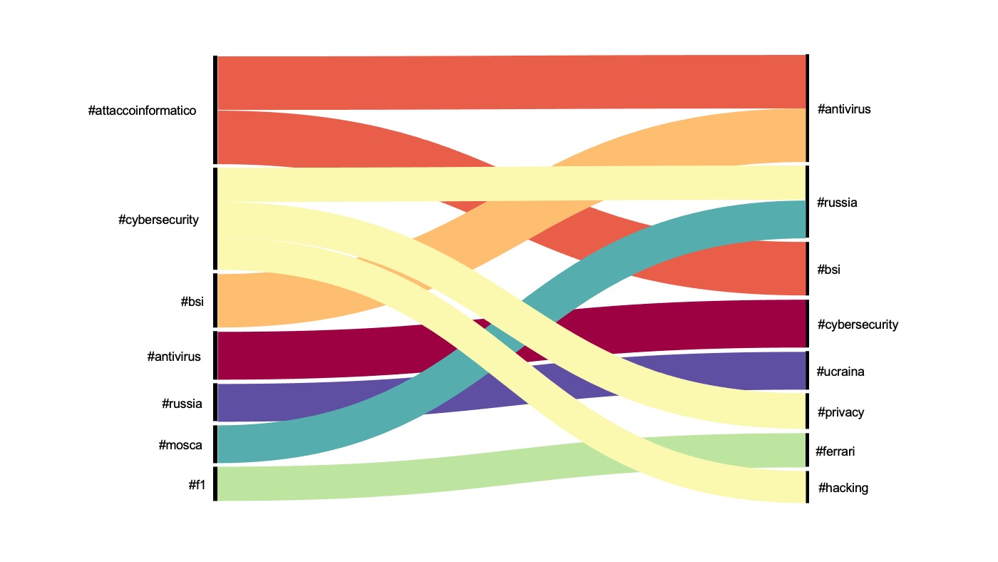
Guide to reading the chart: alluvial diagrams are a type of flowchart originally developed to represent changes in network structure over time. They help visualize correlations by visually connecting categories. Correlations are represented with curved lines whose width is proportional to their value. The chart shows the frequency of co-presence of secondary hashtags. Learn more.
Example 2: Visualize Twitter hashtags distribution in a time period.
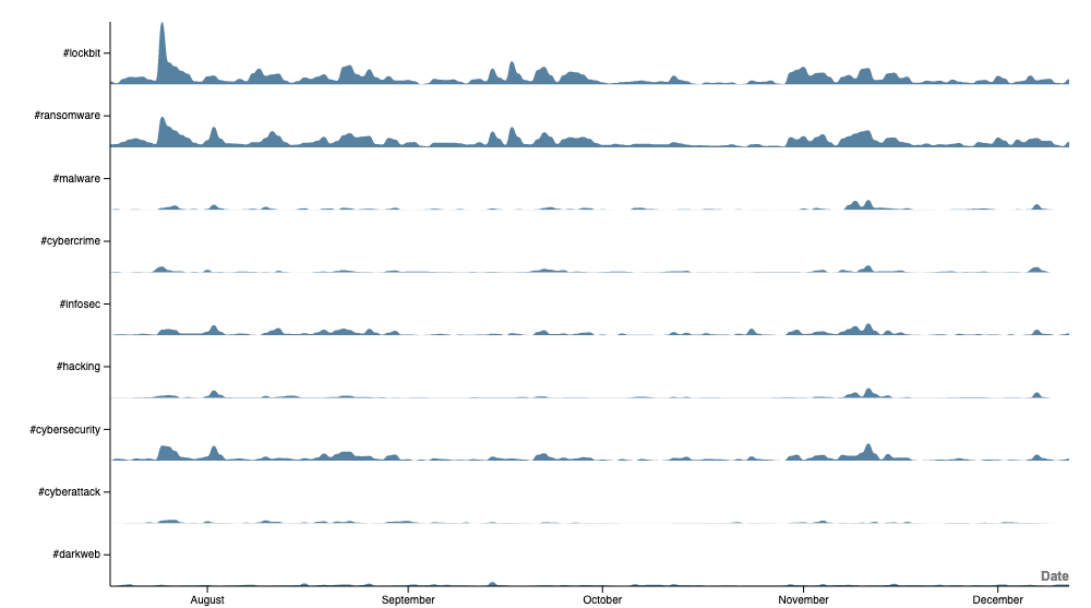
Horizon Graphs displays a quantitative dimension over a continuous interval or time period. The graph represents the distribution of the most frequent hashtag used with the hashtag #lockbit in a sample of 30.000 tweets collected form July 2022 to Dec 2022. Data collected with Socioviz.
Example 3: Visualize tweets language distribution in a time period.
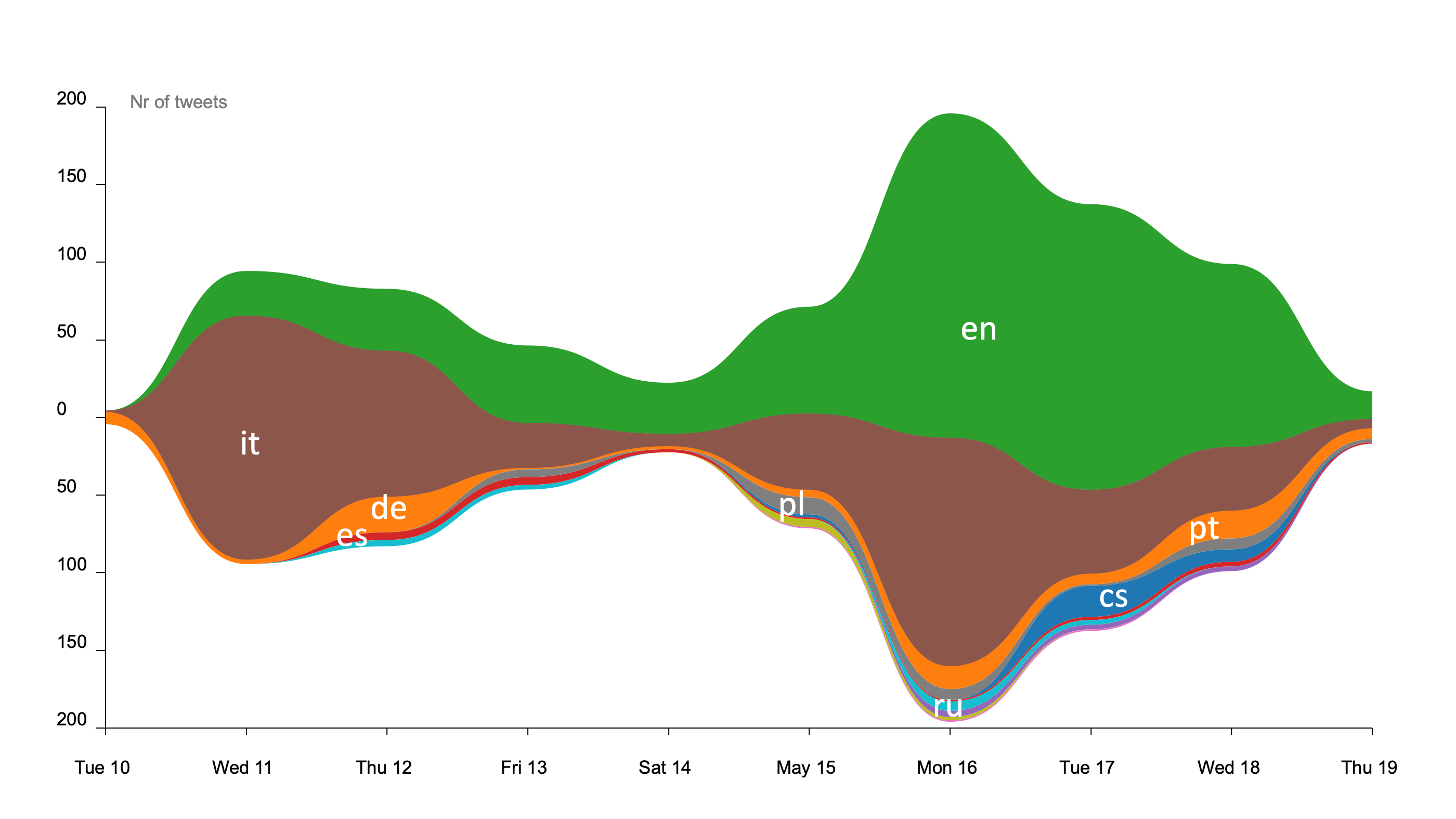
Stream Graphs allows the comparison of multiple categories over a continuous dimension. The graph represents the distribution of the tweet language in a sample of 30.000 tweets containing the hashtag #lockbit collected form July 2022 to Dec 2022. Data retrieved with Socioviz.
Example 4: Visualize Twitter words co-occourence.
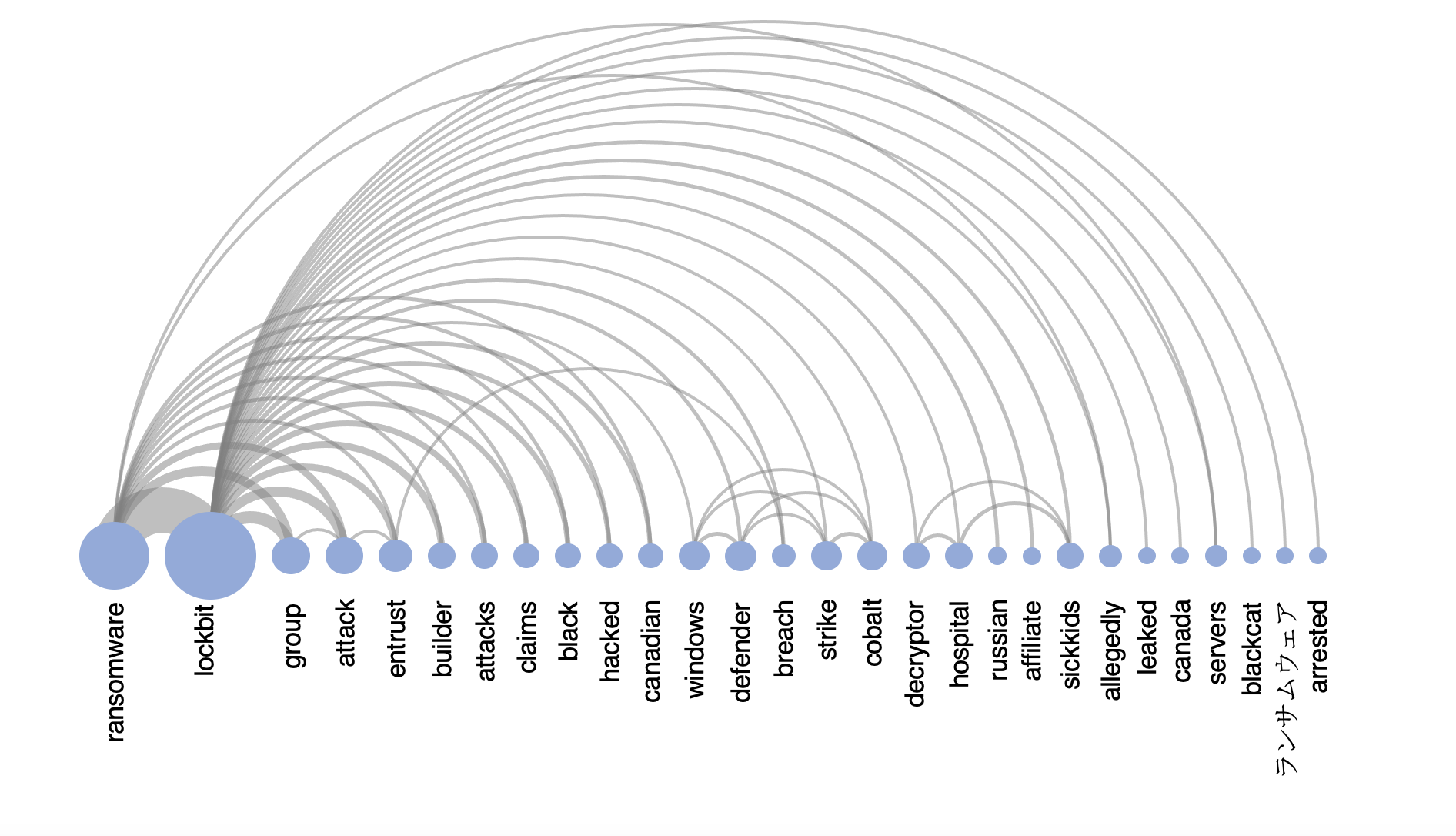
Arc Diagram allows allows seeing relationships among nodes. Nodes are displayed on the horizontal axis, and links as clockwise arcs. An arc above the nodes means a connection from the left to the right, while below means a connection from the right node to the left one. The graph represents the distribution of the word co-presence in a sample of 30.000 tweets containing the hashtag #lockbit collected form July 2022 to Dec 2022. Data retrieved with Socioviz.
Stay tuned, much more is yet to come.
Resources:


Leave a comment